Work         Info


Monochrome

Brand Identity
Packaging
Photoshoot Concept
 
Sub-brand identity for the Monochrome collection, package design, promoting the launch of recreational lenses.


Logotype
A custom logotype structure emphasizes the idea of exploration and the product’s outdoor functionality. The tagline “Go Anywhere” encourages the wearer to fearlessly explore the outdoors. It also acknowledges the shift in environment and function: from indoor workwear to meant for play.


Packaging
Packaging for each of the 5 colorways plays off the associated nature elements. Photographic styling also reflected these chosen environments to inspire imagination in the wearer.


Web Design
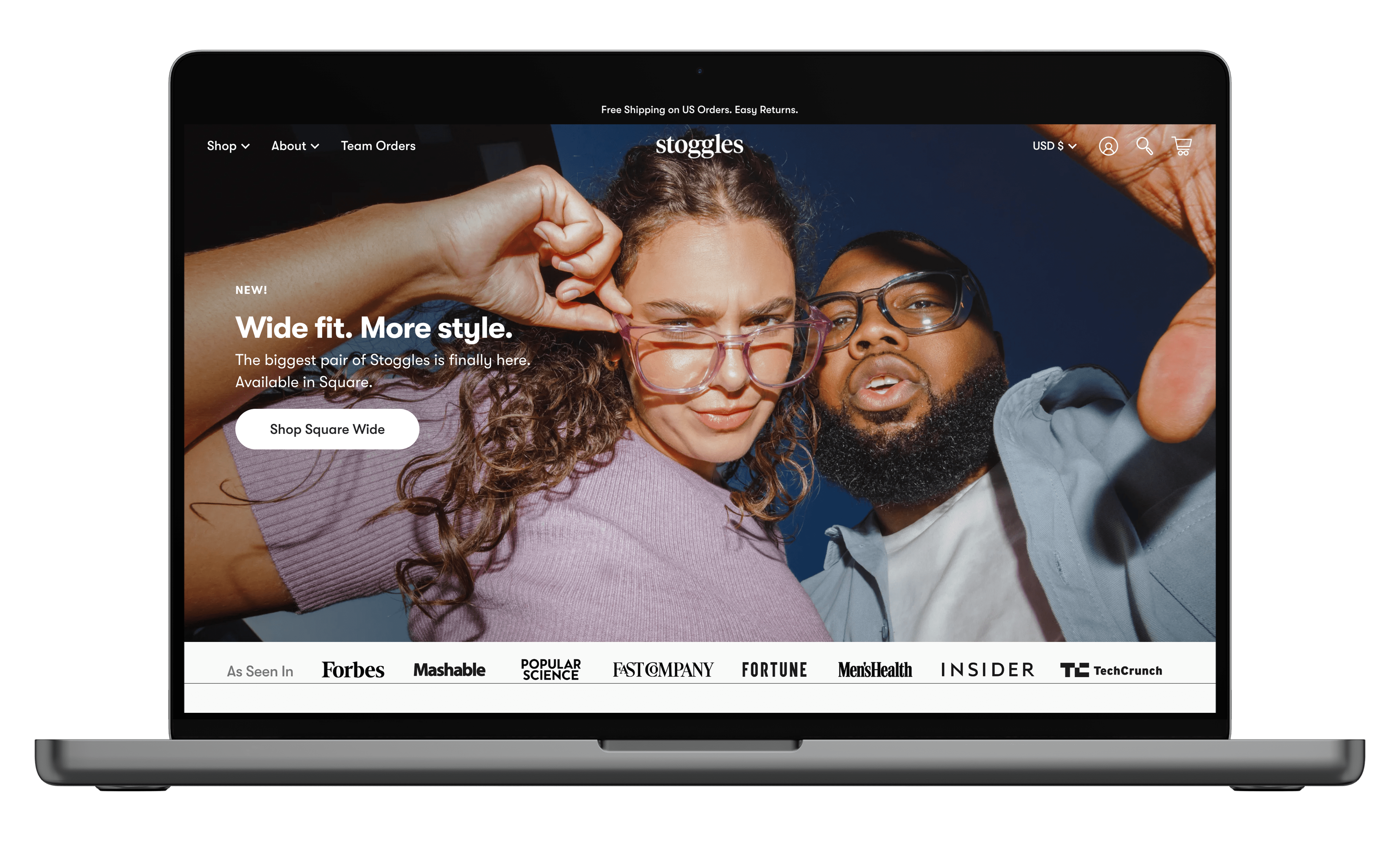
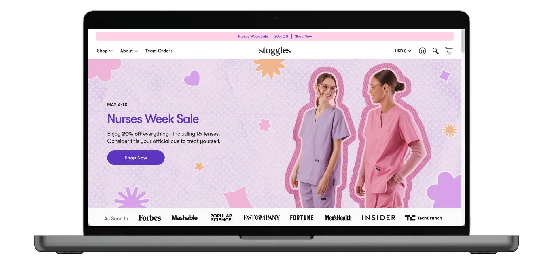
Developed graphic treatment to be used on website.


Social Assets
Designed launch posts and promotional reels.


︎ Home


Dimmers


Graphic Design
Concepting
Set Design

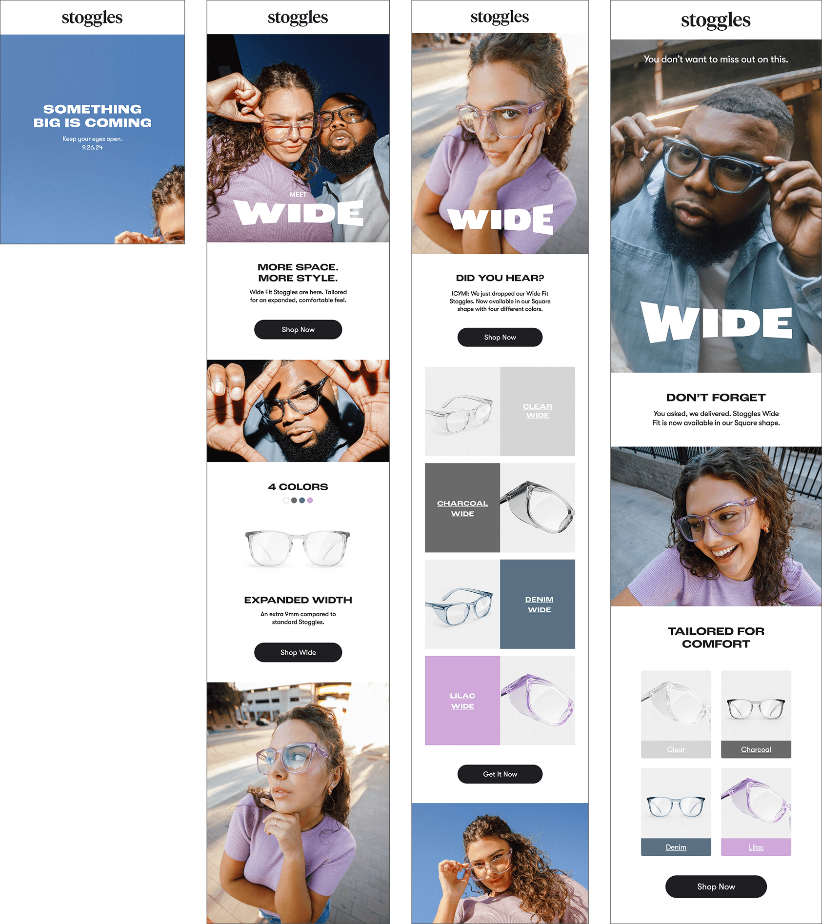
Graphic treatment for the launch of Stoggles’ first ever light-responsive lenses, Dimmers. Campaign assets included a short film, social and web content, emails, and static and motion ads.

Assisted art director with video concept and set dressing.


Launch Film
Launch film concept centered around the ease of use involving Dimmers in daily life. Talent is followed through the course of her day, demonstrating the transitional and stylish function of the Dimmers.


︎ Home

Black Friday/
Cyber Monday


Graphic Design
Photo Concept + Styling
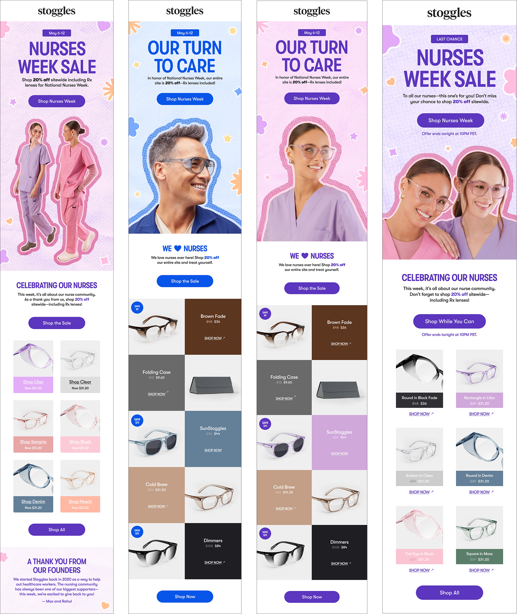
Graphic treatment for Black Friday/Cyber Monday promotions including emails, social, and both static and motion ads.

Assisted art director with photo concept and on-set styling.


Select Photos
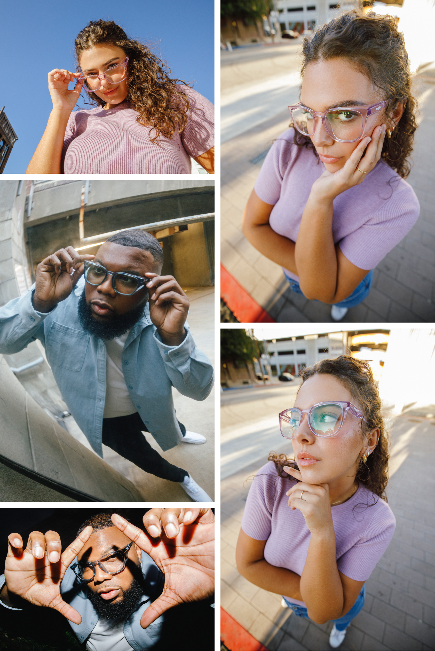
Photos provide a literal take on “Black” Friday and highlight the quality of the glasses.


Select Static/Motion Ads


Email Campaign
Highlights the exclusivity of the sale—Stoggles’ biggest one ever.


Kinhfolk


Brand Identity
Brand identity for Kinhfolk, a Brooklyn-based coffee shop specializing in authentic Vietnamese coffee.


Logo:
References the shop’s focus on Robusta beans, paired with a friendly, approachable typeface.


Play in Progress


Brand Identity
Social Strategy
Brand identity for Play in Progress, a tennis social club dedicated to the love of play without being pretentious.


Logotype
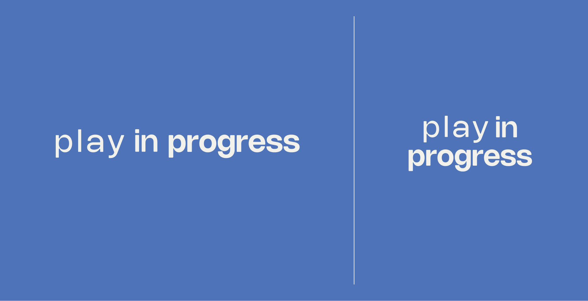
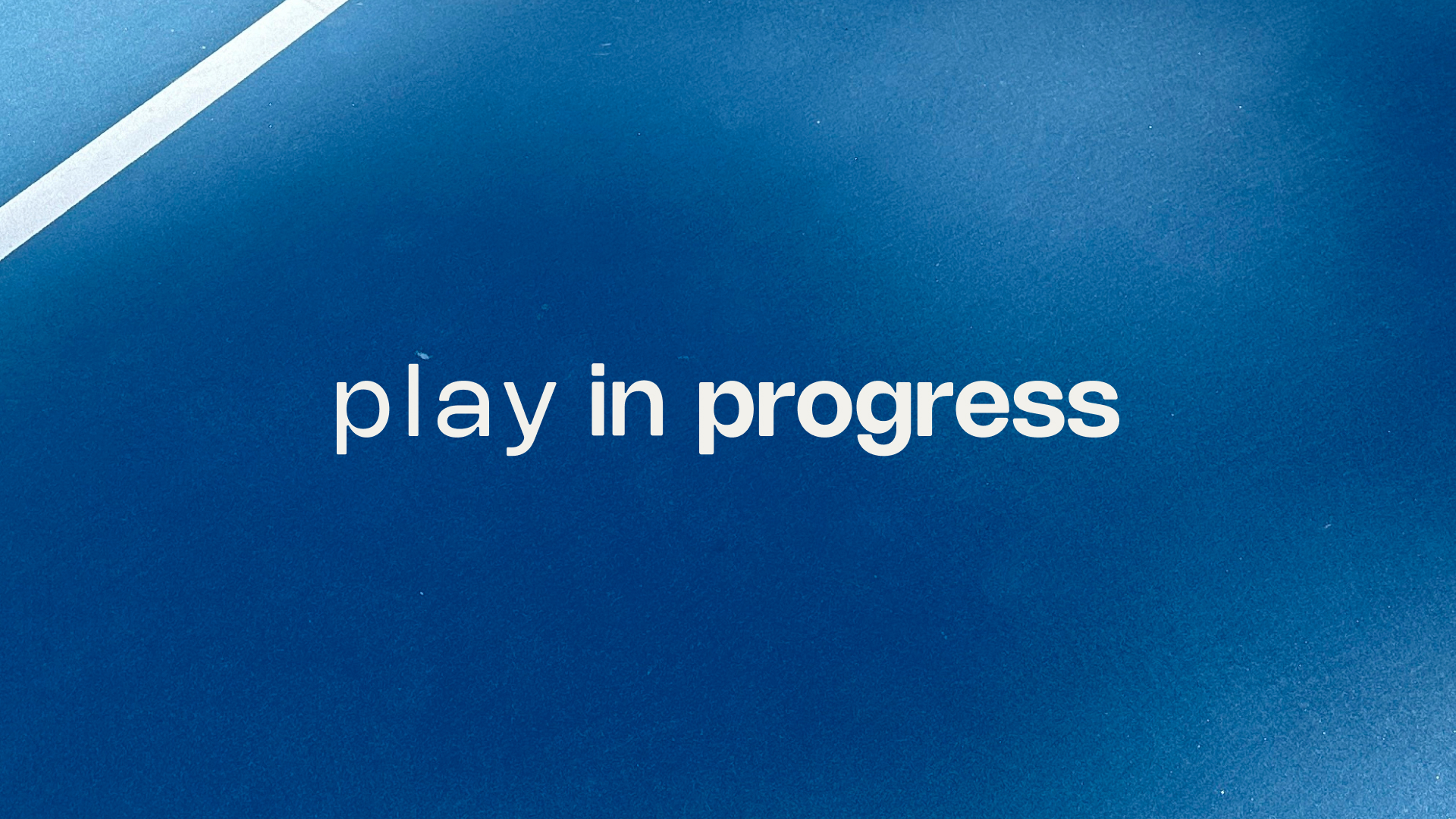
A mixed-weight logotype in a friendly, lowercase san-serif references the club’s open invite to players of all levels of progress. The increasing weights of characters are an additional nod to the idea of speed and movement present within the sport.


Color Palette
Accent green pays homage to the
immediately-recognizable tennis ball.


Typography
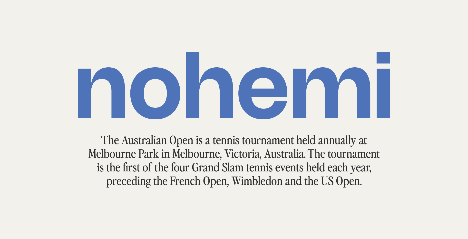
The same typeface from the logo serves as a bold choice for headlines, combined with a vintage-style serif that serves notes of old-money tennis.


Iconography
A robust set of icons created for swag and the brand’s social media presence, which serves as the primary method of communication with club members. 


Photo Library
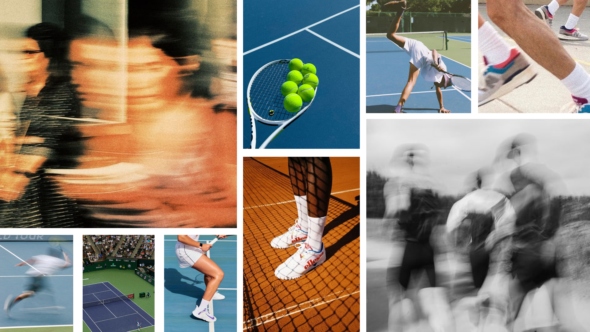
Combining both found and captured imagery to convey a sense of movement and organic gathering. This sets the tone for the brand’s future images.


Social Strategy
Acts as a reference for future social posts.


︎ Home